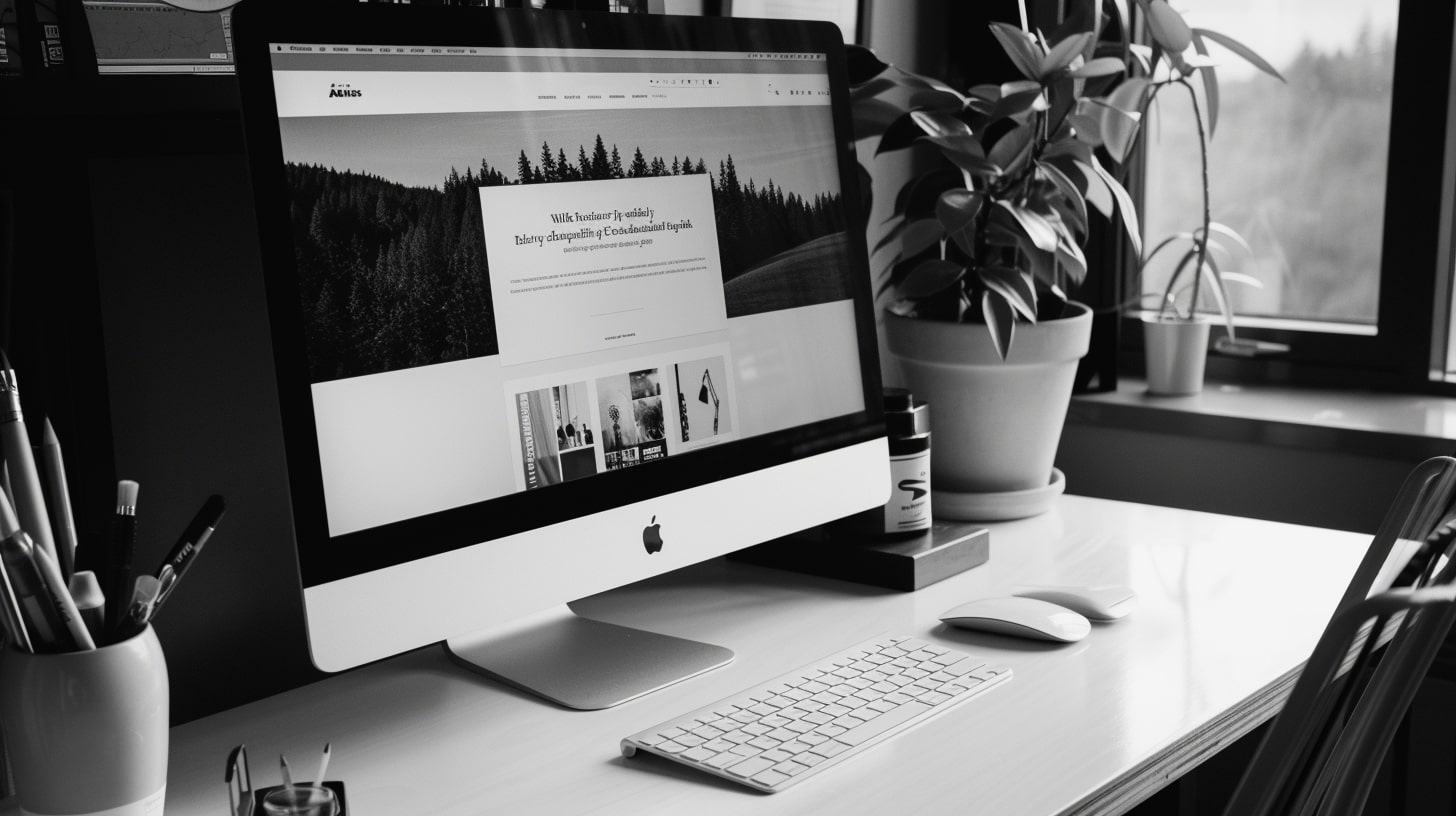
Blog design feels like it should be simple enough. Put together one or two columns, slap some text on the screen, and you’re done!
And if that’s the case then why do so many blogs provide such terrible experiences for their readers? It’s because they don’t follow the most basic of design principles.
But does it matter? Do people still read blogs?
They obviously do because blogs are a great way to get information to your audience. Creators use them to bring in new people from Google (oh, that sweet SEO). Small businesses use them to provide updates on what is going on.
Blogs serve a purpose and that’s why it’s even more important to ensure that they are designed in a way that fulfills a business’s goals. This is why you should always ensure that you’re following these blog design best practices so that you don’t end up in the silly position of making simple web design mistakes.
What Do You Want Your Blog to Do?
At the end of the day we all want our blogs to convert. Be it getting someone to sign up for a mailing list, fill out a form, or purchase an offer.
We blog because we want to move people further along a journey and if the design prevents people from doing that, then the blog has failed.
When reading our blog (you’re on it now) the goal is to get you to see that we understand design and how it can help to make you more money. If the timing is right then maybe you’ll hire us to design your blog for you.
Or maybe you’ll sign up for our mailing list and continue to learn about design so you can implement these principles on your own.
Will it work 100% of the time? Unfortunately, it won’t. But what we can do is ensure that the design is doing its part and not pushing readers away.
The last thing you want is for people to come to your blog, see it, and immediately leave because the design feels like something they don’t want to bother with.
All of this sounds good, but how do you make this a reality?
Blog Design Best Practices Anyone Can Do
Before we begin it’s important to understand that great design is able to make the complicated look simple. And funny enough that’s what makes great design so hard to achieve because when something doesn’t look good many times we try to add more things to it.
Which in many cases takes away from the design.
This brings us to the first practice.
Less Is More
When a person comes to visit your blog they do so to get information. Unlike what you may think, they aren’t there to see your offers, fill out forms, or watch things fly across the screen.
They are there for the answer they’ve been searching for.
The more things that you put to get in their way the more likely they are to leave. And yet we see so many blogs put up sidebars (nothing technically wrong with sidebars) that are loaded with distractions.
Pop-ups that appear before you’ve even read the first paragraph.
Now, some of these things do have a purpose. Maybe you need to increase conversions by 1% and a slight increase in bounce rate is worth the sacrifice.
But when taking in the principle of less is more you should first design your blog with only the content in mind. How can you provide the best reading experience possible?
Once you’ve achieved that, then you can see what things to add to improve other metrics for your business. Or you might be surprised that if you left things the way they are your business will do just fine.
Contrast Is Queen
If Content is King then Contrast is Queen because without Contrast nothing stands out. It might look amazing to create a blog with a dark background and dark text, but it’s a pain in the ass to read.
But contrast isn’t just about color. Contrast is also about shapes and sizes.
Notice the different font sizes used in this post. From the blog post title to the headings to the body text. The contrast in sizes allows for a smoother reading experience while also causing your eyes to pause instead of endless scrolling (which happens when you have walls of text).
What about shapes? Notice that the body text uses a different font than the heading text? Different fonts equal different shapes.
Contrast.
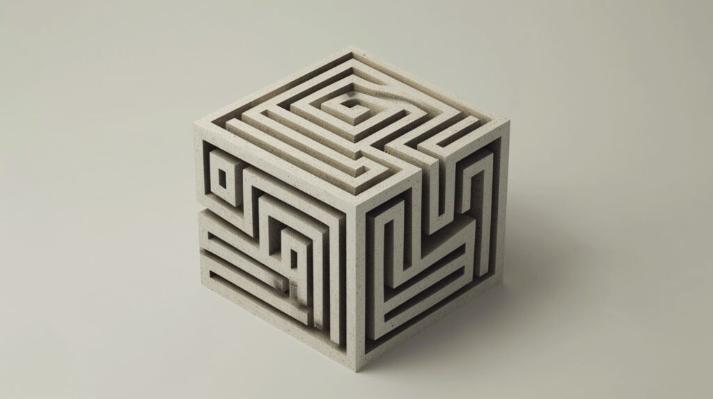
One Path, Zero Maze
Your blog brings people to your business. Each page has an objective and it can be hard to reach that objective if there are many different things you want people to do.
Do you want them to read the blog post? Sign up for your mailing list? Click an ad? Fill out a form?
You might be saying that you want people to do all of these things, but there has to be a priority to the list. The primary objective of anything you see on this blog is to get you to read it.
That means there are no ads or pop-ups. There is no form in the middle of the content.
But the overall goal of the site is to get more clients so how do these two objectives work together? The content leads you to the idea that we can work together. But you came here to answer a question or get a solution to a problem.
You don’t get that if you are too distracted to read. Once that objective has been checked off then maybe you’ll go to the next objective.
Although not every site that I design is a single-column, the majority are. The ones that need more than one column add complexity to fulfilling certain objectives because you don’t know what the reader is going to do.
Are they going to focus on the main content or get distracted by the sidebar?

It’s All About the Text
People come to your blog to read so you must make sure it is easy to read. Try to use a font-size of at least 18px for the body font.
Smaller sizes look cooler, but you don’t want your readers’ eyes to feel like they ran a marathon after each paragraph. Remember, you will very rarely read your blog on the actual site.
And because you know what’s being put on there you might not feel the need to read every single word so your reading experience is going to be a lot different than that of your readers.
You never want your readers to feel intimidated when they get to your site. You don’t want them to have to make the decision on whether or not they want to read your site. You don’t want them to even consider if it’s going to be worth their time.
Make the text a decent size so that the only focus of the reader is consuming the content. If you can do that then you’ll see the retention rate of your site improve greatly.
Make Links Look Like Links
One of the great things about the web is how everything is interlinked. It’s fun to go through a blog and bounce around to the different pages. It’s like finding a treasure chest in a maze.
But that only happens if you ensure the links look like links. There are too many blogs that try to get cute with their links. They’ll make them a similar color to the text and so the only way to know if something is a link is by hovering over every word.
Nobody wants to do that shit.
Make your links stand out and if the concern is that it will cause people to click away from the post then ensure that every link opens in a new tab.
You can set this up to be the default action by using RankMath.

With our current design (hopefully this doesn’t change by the time you read this) we are using a blackish color for the regular text and a reddish color for links. You can’t miss the links in any of the blog posts.
You Need to Create a Pleasant Reading Experience
Somewhere along the way many designers have forgotten about the importance of a pleasant reading experience. The focus is on so many other elements of a design that the actual reading portion gets pushed to the side.
And yet, why else are people going to visit your blog?
It’s not because they are impressed with the widgets flying around or how you’ve layered 27 photos on top of each other to create an effect that people are going to forget about.
Imagine someone deciding that they are going to sit down and read your blog for the night. They aren’t going to read anything else.
Just your blog.
Would that change your focus on how you’re going to design things?
Bonus Practice: Mobile First
Chances are that the majority of your readers are going to come to your site via their mobile devices. The mobile experience is completely different than the desktop one.
But because many of us design our blogs on our desktop, the mobile experience gets neglected. Your job should be to design the best mobile experience possible and then as the screen gets bigger figure out if there are other elements you can add to enhance the experience.
Don’t just add shit to fulfill your own ego because after the first 3 visits that you do to your blog, you’re going to see that cool thing doesn’t do much at all.